






Related news
Overcoming the Color Penetration Challenge in Digital Printing on Silk Scarves: A B2B Quality Guide
Jul. 09, 2026
320
Digital printing helps fashion labels, designers, museum shops, and private-label buyers copy photographs, gradients, watercolor effects, and complex artwork on silk.
Yet good digital print scarves need more than a nice design file. One frequent quality problem is color penetration—the gap between the printed front and the back side. Without the right fabric choice and sampling, the back may look pale or uneven with the planned product level.
For B2B buyers, silk weight, weave, artwork, and printing method all need thought before bulk runs.
Why Does Color Penetration Affect Digital Print Scarves?
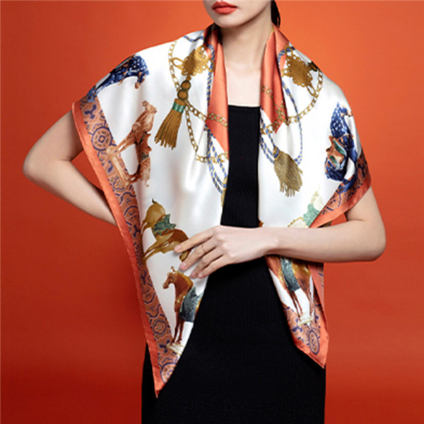
In standard single-sided printing, the design goes on one face of the silk. The color seen on the back comes from dye moving through the fibers, not from a second print run.
So a visible pattern on the back does not mean both sides show the same color strength. The front may look full and rich, while the back looks lighter.
This gap shows up when a scarf is folded, tied, or twisted. It can lead to:
The right result depends on the target market. A lightweight promotional scarf may not need matching colors on both sides. A museum item, designer piece, or premium line usually needs tighter control.
How Does Digital Printing on Silk Scarves Work?
Digital printing on silk scarves starts with fabric pretreatment. The silk must take up dye evenly while keeping pattern edges sharp.
Poor prep can cause:
Adding more ink is not always the fix. Too much ink can hurt clarity and make the fabric feel stiff.
After printing, steaming helps reactive dyes bond with the silk fibers. Washing then removes extra dye and residue. These steps shape colorfastness, softness, and long-term stability.
Single-Sided Printing
With single-sided printing, reverse-side color depends on fabric thickness, weave density, design colors, pretreatment, and finishing.
This method suits lightweight silk, small collections, and flexible order sizes.
Double-Sided Printing
Double-sided printing builds a controlled image on both faces. It can match the same colors on each side or use one pattern with two color sets.
It fits premium scarves, reversible designs, and dark-background artwork better.
Which Silk Fabrics Produce Better Print Results?
Fabric weight shapes penetration. Lightweight silk lets dye pass through more easily. Thicker silk gives better structure and drape, but the back of a single-sided print may still look lighter.
Silk Satin
Silk satin shows a glossy face and a less shiny back. Even with good penetration, the two sides may look different because they reflect light in different ways.
It works well for saturated colors, photographic artwork, and rich decorative designs.
Silk Twill
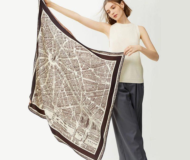
Silk twill holds a stable diagonal weave that keeps detailed lines clear. It is widely used for premium square scarves.
Medium or heavier twill may need double-sided printing when balanced color matters.
Silk Crepe de Chine
Crepe de Chine offers a soft drape and a lightly textured surface. It suits floral artwork, watercolor effects, and softer color shifts.
Sampling should check shrinkage, line clarity, and pale-color results.
Silk Habotai and Chiffon
Habotai and chiffon are lightweight, so single-sided printing often gives stronger reverse-side color. They suit airy scarves, though they give less structure than satin or twill.
Artwork also shapes penetration. Navy, black, and other strong shades usually show more clearly on the back than cream or pastel tones. Fine lines, borders, lettering, and symmetrical motifs need close checks.
When Is Double-Sided Printing the Better Choice?
Double-sided printing should be picked when the back side matters to the final product.
Good uses include:
Single-sided printing stays practical for lightweight fabrics, trial runs, small batches, and items where the back shows less.
Double-sided printing does not mean simply adding more ink to one surface. Too much ink may cause bleeding without a clear back image.
How Can B2B Buyers Control Color Before Production?
A physical sample is key because screen colors cannot show silk sheen, weave, absorption, and finishing fully.
Before sampling, buyers should confirm:
The sample must use the same silk weave, weight, printing method, and finishing planned for bulk runs.
Checks should cover both sides. Buyers should compare color depth, check pattern alignment, inspect borders, and confirm small details stay clear.
The scarf should also keep a soft hand feel and natural drape. Colorfastness, shrinkage, hemming, ironing, and final measurements need review before approval.
The approved sample then serves as the reference for bulk checks.
What Can a Museum Exhibition Project Teach Buyers About Print Quality?
A recent Zhigeng Silk project shows how technical printing choices support an artistic item.
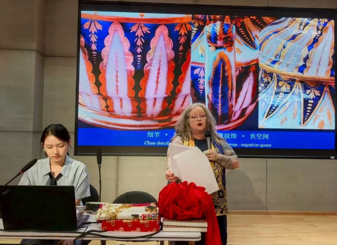
One client built a silk collection for the Silk, Known Again exhibition at the China National Silk Museum in Hangzhou. The show ran from June to September 2026, with the opening on June 27.
The project looked at how decorative patterns moved from Chinese silk to European porcelain and back to silk. The designs mixed deep navy backgrounds, gold-toned details, cream parts, warm brown tones, feather-like shapes, and ornamental lines.
These details brought production challenges. Dark zones needed strong saturation, while pale parts had to stay clean. Fine lines needed accurate reproduction, and the fabric needed enough structure to show the artwork well.
The scarves were shown and readied for sale, so they had to meet both artistic and commercial standards. Color consistency, drape, hemming, and retail finishing all mattered.
The project shows that artwork transfer relies on coordinated design prep, fabric choice, sampling, printing, finishing, and inspection.
How Does Zhigeng Silk Control Digital Print Quality?
At Zhigeng Silk, we review the full product idea before suggesting a printing method. We weigh the artwork, color spread, silk weave, fabric weight, dimensions, and expected reverse-side look.
For lightweight fabrics and flexible small orders, we may suggest single-sided printing. When clients pick thicker silk or need balanced color on both faces, we may suggest double-sided printing.
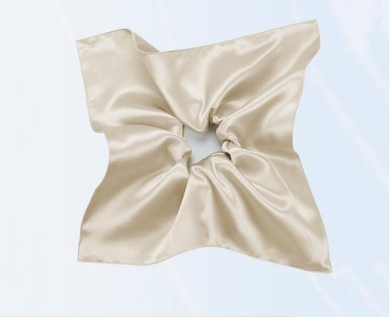
We make our silk scarves in a variety of silks. These are silk satin, silk twill, and Crepe de Chine. The shapes are square, oblong, diamond, and triangular, as well as other forms that may be required.
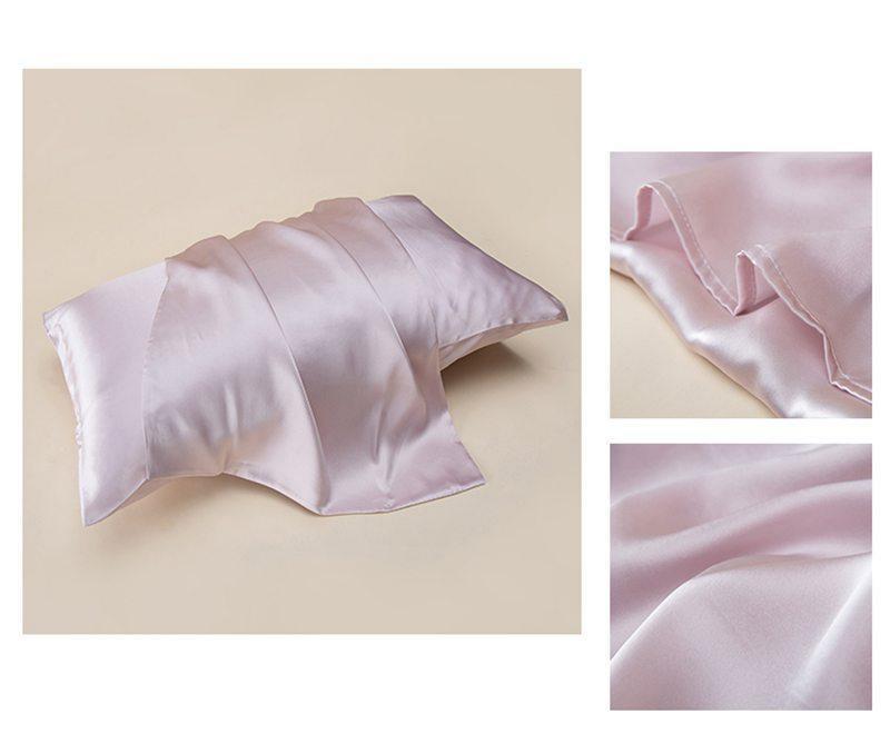
The same care has to be given to the other silk goods we offer. People researching what a mulberry silk pillowcase is, how to wash a mulberry silk pillowcase, and the benefits of using a mulberry silk pillowcase for hair and skin are also interested in the quality of the fibers, the construction of the goods, and the care. When developing a product of silk fibers, such as a slip silk pillowcase or a pure mulberry silk pillowcase, or even a silk scarf with an artistic design, the most important aspect is the correct choice of materials.
We lower production risk through artwork review, physical sampling, front-to-back comparison, alignment checks, fabric inspection, and approved-sample control.
FAQ
Q: Does digital printing work on both sides of silk?
A: Standard digital printing applies the design to one face, while the reverse receives color through penetration. Double-sided printing works better when vivid colors are needed on both faces.
Q: What is the best silk fabric for a digitally printed silk scarf?
A: Common silks used for printing are Silk Satin, Twill, and Crepe de Chine. Lightweight silk gives better penetration, while thicker silk gives better structure and is more suitable for premium double-sided printing.
Q: How can brands prevent color bleeding or fading?
A: Brands should pick the right silk, approve a physical sample, and control pretreatment, steaming, and washing. Bulk checks should also verify colorfastness, print clarity, reverse-side appearance, and softness.

 consult
 WHATSAPP
 leave message
 top
top